Showing posts with label Masterclass. Show all posts

Friday, July 14, 2023

Getting Ready for More Mosaics on Off the Wall Friday

 After much angst,  I did manage to come up with a photo for my upcoming Timna Tarr's Stitched Mosiac class.  Good thing too since it starts on Monday morning!  I did do a lot of research, but ultimately I took the easy way out and bought a picture from IStock.  


Points that lead to this choice

  1. It has the same joyful theme that Tessa's Mosaic does so it will form a series
  2. The color palettes will be similar
  3. No faces to obsess about
  4. Hands that I know how to do
  5. Landscape orientation

You see, somewhere in my research it dawned on me that starting a series of mosaics would not be a bad idea.  Timna's farm animals series is really strong not just because of the subject matter but because she used similar construction methods, emotional themes, and the size of pieces.  

With the inspirational picture chosen, all that was left was to pack.  With this class, that's pretty easy and you bring all the scraps you own.  (Good thing I had most of them still packed up from last year!)  Now you might think, "Nina, can't you just bring the colors you see in the picture?"  Well ... no.  Our job as artists is not to just replicate the photo.  I mean why do that?  You already have a perfectly good photo that you paid $12 for.  No, our job is to breathe new life into the photo and for that, you need a full palette of colors.

Last year's class complete with scraps everywhere

Of course, don't even ask me how I'm going to, "Breathe new life" into this photo - but I'm sure that it will occur to me once I start running my fingers through my scraps next week.

Plus there will be 6 other quilters in the class who I can unload share your scraps with. 

Okay now under things I like....

I found this quote from the play "The Shape of Things" by Neil Labute concerning shock art which made me laugh...

"Anybody can be provocative or shocking. Stand up in class and take a piss. Paint yourself blue and run naked through a church screaming out the names of people you’ve slept with. Is that Art, or did you just forget to take your Ritalin?”

I know right?  So over shock art....not impressed at all!


So What Have You Been Up to Creatively?

You are invited to the Inlinkz link party!

Click here to enter

Friday, June 3, 2022

Classes and What I've Learned on Off the Wall Friday

So recently I read a  great post Chris wrote on her blog about classes she took.  Then Joanna followed it up with her take on the topic here.  The same week, a new friend from Timna Tarr's class asked me how did I learn how to make abstract quilts.  It struck me what a big part taking classes has played in my life. When I say big part, I mean life-changing. 

To be fair though, I've always prioritized education and it's been a passion of mine right from the beginning.  So when I discovered quilting why would that be any different. I did take a couple of classes at the beginning on the local level (1995 ish).  One was to learn how to needle turn applique and the other to learn how to bind the quilts that were starting to pile up.  But from reading Quilter's Newsletter magazine, I knew that there was more to quilting and I wanted to learn it! 

So here are some classes I took and why they changed my life.....

Joan Colvin - Nature of Design, 2001

This was the class where I realized that although I had no art background I could make an art quilt.  Artistic ability was something you nurtured not that you were magically born with.  The class started out with me a hot mess...me pouring my heart out on my failures to new friends Philipa Naylor and Christine Fries...and them encouraging me to start over.  So I did and made this


What else I learned: Rough Edge Applique, Free motion quilting, and you can learn as much from your classmates as your talented teacher.

Jeannette DeNicolis Meyer  - Design Essentials,  2005 (I think - grin)

Jeanette taught me that there was a whole set of design elements I needed to learn and why you apply them to make your composition.  She also finally showed me why people like abstract art and what makes good abstract art and not so good abstract art. She taught me the importance of using the right artistic terms when speaking of art. So I started my praise series with this..


What else I learned: That most creative process goes through a rollercoaster of - Wow What a great idea - Oh this is harder than I thought - OMG this SUCKS! What was I thinking? - HolyMoly Did I make that????

Elizabeth Barton, Inspired to Design (2008), Abstract Art Quilt (2013)

If I was being honest, Elizabeth has had the biggest impact on my artist career.  Her methodical method of making art quilts really resonated with me.  I learned how to take my time and plan at the beginning of a quilt so it will save you some heartache later.  I learned how to select a palette and how to edit and critique my work. 


We dyed the fabric, designed it and sewed 

From our Masterclass


 What else I learned:  How to dye gradations of fabric, always include a neutral in your quilt


Rosalie Dace - Thinking Eye (Paul Klee) - 2012

I've taken several classes with Rosalie, but this is the one where she taught me that there was a lot to be learned from master artists.  Once I started studying Klee, I then wanted to learn about all other artists and it started a kinda of art history obsession.


Praise Ladies II

What else I learned: When putting together a palette, include all values, saturations, and hues to bring your piece to life.

Vicky Luffman - Silk Painting - 2019

In this class, I learned that I don't like to paint....I mean really don't like to paint.  If I was going to take a class for 5 days I want it to have something to do with textile.  (and preferably nothing to do with a paintbrush).  This is not to disparage this class - it was a great class (for someone who wants to paint!)  I also learned that all the design elements I learned up to this point could easily translate into any medium.
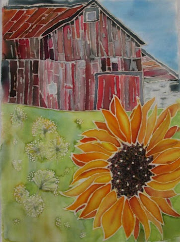
Procion Dyes painted on silk

What else I learned:  Research your class thoroughly before signing up.  (I honestly thought this was a surface design class!)


So those are the classes that had that "Ah-Ha" moment for me.  I can absolutely say they were well worth the time, money, and energy.  Of course, there are honorable mentions - Jane Dunnewold, Complex Cloth who taught me I didn't want to surface design but I now knew how to if needed ...Judi Warren Blaydon who taught me how to college, and Cynthia Corbin who taught me so many things over the years about composition I didn't include her above because it's hard to narrow it down to a paragraph!  


So why do I take classes??  The easy answer is to learn.  The more deep answer is to change my life. 

What was your favorite class?


You are invited to the Inlinkz link party!

Click here to enter


Friday, April 2, 2021

Let's Talk Pattern on Off the Wall Friday


#1

My gosh, a moment to breathe!  Believe it or not, in my retail world Spring Rush is more hectic than Christmas.  A Spring Rush as the country is starting to open is that much more hectic.   I take call after call which all start out in the same way..."Thank You for Calling My Company, I'm Nina-Marie how can I help you?" It's a familiar pattern but after that you're never quite sure where the call is going to go!  (And since my customers are all about 75-100 years old, I'm sure you understand...grin)  

I bring this up not only because it's dominating my days but also because our lives are full of familiar patterns.  If anything this year has taught us is that when those patterns are disrupted, we all feel out of sorts.  However, since they are so much of our everyday life, we tend to take patterns for granted.  

#2


In Rosalie Dace's recent lecture on pattern she really brought to mind how much inspiration is in our
everyday lives.  Now we aren't talking about pattern like people conventionally think about patterns...like wallpaper, upholstery fabric, tiles etc.  Those are all so predictable.  Don't get me wrong predictable is good but there is something a bit more interesting in a pattern with a repeat that is without predictability.

Case in point....look at the black and white line images #1, #2, #3....which are you drawn too?  The ones that are predictable  or the ones that start out predictable and then variation is added in. Look at the thickness of the line, the lengths, the angles, the stops and ends.  So much to take in right?  


#3

All three pictures are interesting  with line, but the ones that have less predictability captures the viewer's attention the longest.  So much to think about and explore.  With #3 we know what is there at a glance and we know  where it's going.  Now that in itself is not a bad thing and the rhythm is comforting....but...predictable.

While we're talking about these three line drawings....let's talk about what's important in them.  Is it the black line or is it the space between the lines?  Modern Quilting has brought negative space back into focus for sure.  It's so easy to overlook it sometimes.  Pattern isn't always just formed by those black lines but also the secondary pattern of the negative space around them. If you're a having a hard time focusing on the negative space squint your eyes.  See it now??  Cool right?!  

Look this is not rocket science for sure!  You want to add interest to pattern, add variation.  Make sure that your lines are not all the same length with the same distance between them.  The hard part is coming up with a composition that has enough variation to add interest without being too chaotic.  Chaos for the most part in composition is not good. (well and then Jackson Pollock showed that isn't always true either...hmmmm rules for sure are made to be purposely broke!)

Ohhh and of course remember....the lines definitely don't need to be straight!


 So take some time to draw some lines - play with pattern - take pictures of patterns in your everyday life.  Edit the photos to show contrast and play with the negative space.  Look! Look! Look!

And is there anything else I can help you with today?

Oh wait...that's my day time ending....my blog's pattern ending goes like this...

So What Have You Been Up to Creatively?


You are invited to the Inlinkz link party!

Click here to enter

Friday, March 19, 2021

Color Trials Continue on Off the Wall Friday

 So last week, I finally finished up my first exercise in color and value.  I'm all proud of myself since it really illustrated visually what I knew intellectually.  So much easier with a picture don't you think?  

You can see my observations on the first four columns here.  This week I added the last which was to add the complementary color of  the red - green.  Now it didn't turn all Christmas which was my daughter's guess.  I knew enough to combat that by  changing the saturations of the green.  What I did notice was that as always complimentary colors play off each other giving a lot of give and take between them  The conversation at this party gets loud with the white and black and grey kinda just fading in the background.  I mean really ... in that last column do you even  notice all the white, black and grey in there?  


With those done, I wanted to see how the column interacted with each other as well as different backgrounds.  So through this whole process I've kept them in columns on my white design board.  I'm actually rather shocked at how well they look together now that they are done.  The white to me seems to just sort blend away.  It doesn't seem to pick up the white in the piece any better or worse.  It definitely doesn't make for a good "frame" for all that chaos....in fact to me it just makes it feel more chaotic since the white along the edges "leak out" on all sides.  


So let's change it up with a black background.  


The black gives it the strength and grounding it was craving.  Also it makes the white parts pop.  I find the sashing gives a bit of stability to the chaos of the columns.


Now this was interesting!  All the black bits are giving a subtle "structure" to the piece.  It's like the glue that holds it all together but  not nearly as uniform as the sashing in it's sister piece.  Also, notice that there are just as many black  pieces leading out to the edges as the  white above.  But these don't have the same  "leaking" effect.  Instead it gives them a STOP softening the edge but still giving it a distinct edge.

THEN I stole Tessa's grey blanket away from her.  Actually I originally bought it for this exact purpose but it was so super softie in microfiber that she stole it from ME.  Just as well though since all that polyester captures the light and reflects it back to the camera which kind of defeats the whole purpose of using grey.  


That all said, you can see that grey really is a true neutral in both cases.  It doesn't do much for the piece but it doesn't really detract from the columns.  It's not strong enough to add the stability the piece needs but it's not letting the white leak all out the sides and bottom.  Sometimes grey is perfect, but I'm thinkin' this time it's not.


At the beginning of these trials, I had no idea what I wanted to do with these columns.  I mean really you could sit in your chair and talk your way into a plan that might or might not work.  But just by doing a few visual trials really gives you a better picture of how the columns will react with each other and a potential background.  This information can then be ferreted away for the next time so you might not need to go through all this!

 I'm going to finish this piece off with one of the black options but just haven't figured out which.  I'm not a big fan of "frames" on my pieces but with this mess - yes - it needs a frame.  I'm so happy I took the time to work out these exercises!


So What Have You've Been Up to Creatively?

You are invited to the Inlinkz link party!

Click here to enter

Friday, March 12, 2021

Masterclass Session III on Off the Wall Friday


 My masterclass with Rosalie Dace continued last week with us delving into the world of pattern and rhythm.  Listening to these lectures which are recorded so you can re-listen to them I find very helpful.  It's not that it's new material.  It's that #1 material that you just don't think of in your everyday of housework, errands and laundry and #2 Rosalie offers these "nuggets" of wisdom that help you focus on what is important.  This lecture really focused on pattern and rhythm in your everyday life.  I especially found this fascinating.  I do promise to explain what I mean in a later post but for now.....

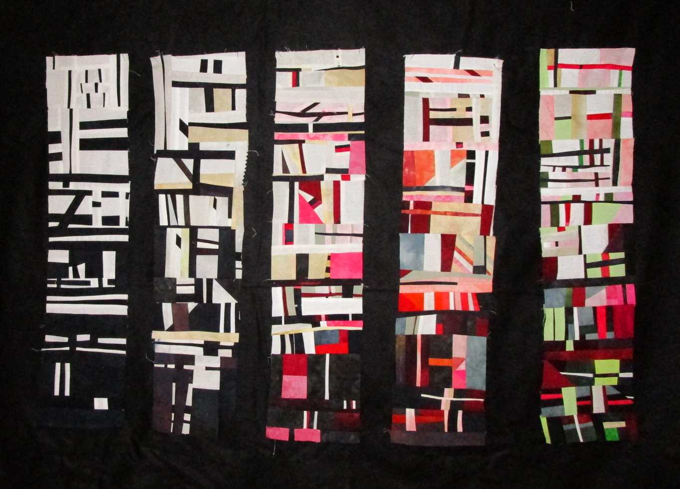
I NEED TO FINISH MY EXERCISES ON COLOR AND VALUE from week #1.  Why is it that quick little projects seem to take on a life of their own?  But I promised myself I wouldn't rush through these and I'm not.  I'm all happy with this composition and where it's going. Reading Left to Right...  Column #1 is Black/White ... Column #2 Black/White and shades of neutrals ... Column #3 Black/White and the primary Red ... Column #4 Black/White/Primary Red and the Analogous color Orange . (Analogous color is the color that is your neighbor on the color wheel)


Some Observations (because that's why I'm doing this exercise)

  • Black/White it's all about a strong graphic statement.  It's all about contrast.  There is no wiggle room...no mystery.  It's strong but flat
  • Adding the shades and tons of black starts to give it a little depth but I didn't add enough for it actually to matter a whole lot.
  • With the Red, a whole new person is invited to the party.  Now it's not just a conversation of two people but three with all that that entails.  You can tell  too.  It's going from this vary graphic statement to a composition with more nuance.  This is starting to draw you in more to see the little bits.  How the shades of Red interact with the shades of the neutrals is very interesting.
  • So when Orange joins - well now the party is in full swing.  Tessa took one look at it and said wow that got busy.  It did but it's not just the piecing.  It APPEARS more busy because now you have two neutrals and two hues and all their values playing around.  It's no longer this graphic statement but several little compositions interacting with each other.  Also now the neutrals are not just highlighting the red but it's also about the relationship between the orange and red.  
Since each of these are taking 2-4 hrs each they're going slow.  I do love piecing .  It's so relaxing!!  The

next  column is Black/White/Red and its compliment Green.  I'm also thinking about doing one that is black/White/Red and two analogous colors ... but hmmmm I dunno.  See what I mean ...A LIFE OF IT'S OWN!

 Things I Like...

Did I tell you I got a pair of Kai 7170 Professional scissors for Christmas.  Omgosh!!  I'm in love with them.  Not only are they the sharpest scissors, I've ever owned but the action on them is so amazing.  Every time I go to cut fabric, I'm reminded how wonderful they are.  Their handle is just right too.  Not to hard - not to soft.  I told my husband now I want another pair so I can stop reaching all over my studio for those specific scissors.  All my other scissors just sit on my table unused.  WORTH EVERY PENNY!  I just wish they had a pair that was a 5" range or so.  I use both sizes a lot in my studio.


So tomorrow I took a half day off to sew and maybe - just maybe - I'll finish up my value/color exercises so I can work on rhythm and pattern - grin!!  It's good to be back in my studio!

And just because I don't say it nearly enough.  Your thoughtful, comments mean a lot to me.  I'm always a bit shocked people actually read my posts more less comment!!  So THANK YOU!

So What Have Been Up to Creatively?

You are invited to the Inlinkz link party!

Click here to enter

Friday, March 5, 2021

Masterclass Journal I, II on Off the Wall Friday


From Branching Out in 2005
I met Rosalie Dace in Morrisville, NY in the summer of  2005. I liked her immediately.  She had a no
nonsense air about her but also she was warm  and laughed easily.  I remember it was hot that week and I worked hard coming up with a my idea of what  a tree art quilt should be.   It was intimidating working in a classroom of women all 20-25 yrs older who mostly knew each other  and looked like they knew way more about quilting than I did!  It seems like  forever ago.  Rosalie though mentored me through the process of my quilt and it came out great.  It finally was dawning on me that I could be an art quilter after all.  

I've taken 3 other week long classes with her and every time I've had fun.  It's hard to describe but it's like Rosalie forms this safe cocoon around her class so you can create.   Shrug.....I dunno....I just know that when I'm in her class, I feel like making something amazing.

Well...that is until this time.  Saturday morning  - Day 1  of our Zoom Masterclass  starts.  I'm already with my tea and a notebook, all comfy in my studio listening to Rosalie's opening lecture. Surprisingly the tech all works great.  I'm a little amazed that everyone seems to have no problem meeting together from all over the country....with Rosalie in South Africa.  Her voice washes over me familiar soothing.  I take in all the photos in her interesting presentation.  Still it's like I'm just  a voyeur in the class and I don't have any inclination to pick up a piece of fabric or scissors  or anything.  Normally I can't wait to get at it.  Not this time...this time I just want to take a nap.  I did manage to work couple of hours and finished one little exercise on composition.  I then flipped the values and tried it in fabric.   I wasn't excited by it but I did it.


Sunday's class started with another great lecture on value and color.  More amazing photos to inspire.  This time though I felt a bit more excited.  Rosalie gave us 10 suggested exercises and I started to work on them.  The first one was a basic black and white study.  The more I worked on it the more excited I got.  And in the way  of Nina, that's where things got out of hand and the exercise has taken on a whole life of its own.


Rosalie says she has two extremes in her classes - the Project oriented  - those who rush through their week making a project and say "Wow Look what I made!"  and the Petters those who spend their week looking at their pretty fabric and sorta dabbling in the exercises.  Most people fall some where in between.  Of course, I did not.  I was a project oriented person  - start to finish type of gal.  But there was a reason.  Not only is it in my personality, but  also this was my one  week of   52 that I could create and not play mother of a toddler.  I could just be Nina for a change and I wanted to have something to show for my week.  

BUT this time I am determine to do it differently.  Finally that  little girl is grown up into an accomplished young woman and doesn't need me hovering.  I have time to slow down and really contemplate the relationship of the values and shapes my exercises create.  At least that what I told myself.  I can see though this exercise is turning into it's own project ....of course it is!


My Exercises so far as of Thursday Evening!

One thing is definite.  I am totally in love with complicate improv piecing.  It makes me happy to loosely guide where the piece is going but then be surprised by where  it is at the end.  Plus it's soothing.  Saturday I had to force myself to work....here it is Thursday and I'm getting up at 5 so I can get a few hours of sewing in before work.

Yep and there is that..... Spring Rush has hit  at work and ladies across the country have decided they will need clothes since they are finally being set free.  So I'm working hard selling clothes during the day and trying to fit in sewing in around it.  The nice thing is that this time I don't have to do it all in a week, I just need to get back into the creative habit.   

I'm so glad I decided to take this class.  It's not the same as being at Quilting by the Lake where you can totally immerse yourself in quilting.  But it is teaching me how to be creative and work around my home life here.  

This week we only have class on Saturday so I'll have Sunday to sew.  Hopefully I'll have more to show next week!!

So that's me....

What Have You've Been Up to Creatively?


You are invited to the Inlinkz link party!

Click here to enter

Friday, March 3, 2017

Hard and Soft Edges - Off the Wall Friday

Quilt I made in Joan Colvin's Class in 2002


I won't lie.  When I opened up my latest lesson in Katie P-M's online class and saw that we were going to explore Hard and Soft Edges, I literally G-R-O-A-N-ed. I mean, hard and soft edges again???  I explored them for the first time when I was taking Elizabeth Barton's masterclass and I didn't really understand them then.  I blundered my way through the lesson and although I wouldn't say it was a failure, I wouldn't say it was a win either.  Not to mention its really hard to achieve them using fabric which by its nature fabric is hard edge kind of thing.

BUT,  I put on my big girl pants and once again tackled the use of edges.

So what is hard and soft edges???  Well in the art sense, a hard edge is the term used when the edge of an object is made in a well defined or definite way. There's a strong sense of where the object ends. A soft edge is when it is made so that it disappears or fades into the background.

Easy right?  Well in painting it isn't so hard.  Here is an example I made where I thought the watercolorist used hard and soft edges effectively.


Why worry about it?  Using hard and soft edges can be very effective to create the mood in a piece like the one above.  Using the soft edges you definitely get the feeling of  WET!!  Also,  if you didn't use hard and soft edges, everything begins to look very graphic and 2-d.  Its bold and illustrative.  Too many hard edges can get a little loud and leaves out the mystery of art.    Too many soft edges make a piece feel all blurry and jumbled together.  That's fine if that's what you're going for.  But for me I like a little soft with my hard.


Now in fabric, its not so easy.  One can't just blend fabrics like one can blend paint! BUT  Once I started investigating and researching, there have been some really skilled fiber artists that have done it quite successfully.  One of which, is the late, great Joan Colvin.  I took a class with her back in 2002, where she taught me to blend my commercial and hand dyed fabric together to get a cohesive and natural look.

Her work is simply amazing.  If you look closely at her pieces, you can see how so many of her larger area are made up of many different types of fabric.  This creates the soft line and adds dimension and interest to her work.  Then she'll use hard line to move your eye around the piece and draw attention to the focal point.  All without you really noticing it - its all so quietly and masterfully done!  (by the way she did it all without fusible too!)


If you want to take a closer look at Joan's work and hear her talking about her process there is an excellent video of Alex Anderson's interview with her.  Watching it, I thought, I never really got to thank her for setting me on this art quilt path that I've explored for the last 15 yrs.

Because this is such a hard subject, I'm still working on my lesson's piece.  Its coming along nicely - but slowwwwwwwwwwwwwly!  Hopefully it will be done in time for Monday!!


So What Have Been Up to Creatively?

Friday, July 10, 2015

Setting Limits - Off the Wall Friday

Limits.  We all have them.  Limits on how much we work, we play, we spend, we eat etc. etc.  And that's what we explored in this week's lesson in Artist Strength Training class.  How do limits effect our creative life?

Now I'm all about limits.  Limits, to me, equal balance and balance equals happiness.  Whenever my life gets crazy or I get crazy or a little bit of both, its usually because the balance is off somewhere.  And if the balance is off, that means I haven't followed the limits I've set forth in my life.

Anyways, Jane challenged us to set up some limits concerning our art studio life.  She suggested that we place limitations on what we buy/store in our studios.  That part was easy for me.  I set up limits for my studio when I moved in.  I only keep what I actually need to create in my studio.  But with this challenge, I took it one step farther.  I officially moved out my dye supplies out, since I only use them a couple times a year.  They can be designated to another close by closet.

Ready to start Sewing again!

Another limit?  I always make sure that I give the studio a good clean at the end of each project.  I honestly don't know how "stuff" migrates into my small space, but it does.  The now uncluttered room always seems a perfect space full of  potential possibilities.  Plus at the end of  project  - when chaos again reigns, I always think, "Wow, It looks like I've been working hard in here!"  Creating is, after all, messy.
BEFORE

The second half of the lesson concerned that piles of UFO's we all have in our studios.  You know the one - its filled with pieces we haven't finished because we lost interest  or because we were stuck on a section or because it was turning out ugly/awkward.  Jane suggested that we  take a piece and give it a make-over, fearlessly changing it for the better.


AFTER
Now my pile isn't that big.  Because of limits I placed already on myself, I don't tend to save UFO's.  Either they're working (they get finished) or they're not (they get tossed).  But I do have have a half a dozen sitting there.  The one I chose for the make-over was a piece I did as an exercise for Elizabeth Barton's Masterclass.

You know, I never did like it.  She liked it but deep down I really didn't.  Even after a year, I still don't.  There are parts I like and parts I don't.  So this week, I spent a bunch of time, taking out the parts I don't, changing the fabric on some and cropping the piece.  They really weren't drastic changes but I like the piece much better.  Might even get the gumption up to bind it - grin!!

So I suggest you think about limits you can set up to make your creative life better - think about putting limits on how many projects you start, how many different techniques you use, how many interruptions you tolerate to your studio time, how many competitions you enter, how many commissions you take etc etc.  How can limits restore balance in your life?

So What have been  up to Creatively?


Friday, July 3, 2015

The Rejection Committee - Off the Wall Friday

Clapboards & Lilies, 28" by 16"
"We regret to inform you that your submission,  Clapboards and Lilies,  was not selected. . . " Sighhhhh.  Yes, for the first time in 10 years, my piece for the local mixed arts Lily Festival Art Show was rejected.  Renounced. Refused! Spurned!!

Okay, so I'm a being a bit dramatic, but rejection stings a bit even by the best of us.  It just plays to all the doubts in your head that your art really isn't good enough and the jury really didn't want to let you play with them anyways. 

But really, what hurts more. . . .being rejected by the juror. . . or. . . proving the Rejection Committee in your head they're right?  This week our lesson in Jane Dunnewold's Artist Strength Training Class is about dealing with the self fears that all artists have that our work isn't really  good enough.  Where do they originate?  How do we dismantle them? How can we rise above?

Logically, I've never really had a problem with Jury Rejections.  I mean, if they can't see that my work would benefit their art show, well obviously, its their lost.  My Rejection Committee consists of one essential person - Myself.  I'm consistently telling myself that I'm not good enough - that I will never be as good as <Insert Famous Quilter's Name Here> - that obviously I'm just fooling myself that I'm getting better.

Now normally, I'm not an insecure person.  To tell you the truth, I don't think its really insecurity that is fueling these fears.  Its more like the over achiever in me.  That's the part of myself that just wants to strive to be better and better and better.. . . well. . . until better isn't ever good enough.  And really with art,  what is good enough?  How do you measure  - Good Art?  Since the measure of good art is so damn elusive, that's what my Rejection Committee has chosen to pray on.  I mean, obviously, they are the only ones that know "Good Art", right??  To them,  I'm just a plebeian playing with fabric and thread.

With the Rejection Committee consistently chiming in their two cents, they clearly need to be shut up.  So how do I fire them?  For me, its by stop playing the comparison game.  I need to stop worrying if my work is going to measure up to my peers.  I need to clearly define why I make art.  Do I make it for the validation of artists I truly admire?  Or do I make art to declare the mental expressions that run through my head on a daily basis.

So on that note, I humbly submit this:

Dear Rejection Committee,

   I regret to inform you that at this time, I can not accept your rejection of my work.  I am thrilled that you have been able to submit so many wonderful rejections, but unfortunately, I have found that, as of now, they no longer fit in with  the personal view of my work.  I would encourage you to submit future rejections, but honestly, I don't want to foster any hope that they will ever again be accepted.

My best advice to you is that you find a new endeavor to expend your energies on.

Sincerely,
Me

Linking to Muv's...Lizzy Leonard's Vintage Sewing free motion giveaway.

So What have been up  to Creatively?


Friday, October 10, 2014

Say it with Color - Off the Wall Friday

I love color.  I know that I spend a lot of time saying how important value is when I'm designing but I still love color more.  So you can imagine how happy I was that this month's topic is color.  Its fun to explore how color can be used to express the mood of a piece.  Its amazing how much you can communicate  with just picking out the right palette.

How you ask? 

 Well here are some tips. . . .

Red, Orange, Yellow - Emotional Colors - strength, energy, joy, enthusiasm, passion, etc

Notice how I used these colors to express my passion for praise - the joyfulness that I feel when I praise God.

I used Blue and Purple for a calm but rich mood


Green - freshness, rebirth, harmony, newness

Blue - water and sky - calmness or storminess - serenity and sincerity

Purple - always adds richness

White is always pure for me and Black is about power


So with those general guidelines in mind I created my sketches for this month assignment.  I took Elizabeth's suggestion and made one sketch.  It was one that I'm going to do a little piece for with Open Studio so why not kill two birds with one stone??  I then interpreted it into three palettes that  - hopefully - create three  different moods.  It was fun to get out the crayons and the color pencils!  Not to mention I love working with organic shapes!


So what have you been up to creatively?


Monday, September 15, 2014

Watercolor Wonder - Design Wall Monday


This weekend I went back digging into my quilt closet - you know the one  otherwise known as. . . The Home for Leftovers and found the fusible grid Pellon.  Don't you love clever people who come up with clever things?  Once the watercolor craze hit in the 90's, the people at Pellon came up with the idea that you could use a light fusible to help sew all the pieces together.  The way it works is that you just put the squares onto the gridded interfacing.  Iron them on.  Turn over the interfacing folding at the lines and sew the 1/4" seam.  Cool, huh?!  

You really didn't think I was going to sew all those 2" squares together did you?  That falls under the catagory. . . "I'm getting too old for this Sh. . . ".  Still there is something relaxing about this project.  I love the rhythm of traditional quilting.  Just spending a couple of hours replacing the squares onto the pellon was quiet easy work.  Sorta like Jigsaws for Dummies.  Once again, my idea of ditching my traditional ironing board and using an ironing "table board" comes in handy!  So much easier doing it on a table!


Anyways, I'll spend this week getting it all sewn together.  For once I'll have my assignment in Elizabeth Barton's masterclass done early.  Notice I'm totally ignoring the suggestion that I take this a step farther and use the technique to come up with a new design encompassing praise ladies.  I mean that teacher of mine - give her an inch and she'll push you a mile!

hmmmm that is what I love about her!

See more great design walls at Judy's Patchwork Times.

Friday, September 5, 2014

Busy! Busy ! Busy! Off the Wall Friday

Since my machine is in the shop getting its yearly check-up, you're probably wondering what  an art quilter can  do creatively this week?  Well, apparently  A-Lot!

I decided to take advantage of the break from the hours I've been spending at my machine, to get in some end-of-the season dyeing. I have this pile of white shirts I've been buying on the cheap just waiting for the hot weather to dye.  Now that its September, 90 degree temps are finally here. . .of course!

 Today, I experimented with Red Solo Cup dyeing. . .the shirt version.  They came out a bit muddle - I think it was the extra squishing I did !  I still want to do a bit more with them - but I haven't quite figured out what!  Tomorrow, with an extra day off this week, I'm going to continue with my experiment with thickened dyes.  I've never done it on my own so this should be interesting!


Of course, the fun didn't stop there.  I took time today to go visit my friend Sandy in her air conditioned studio.  She gave me a peak at her Quilt National entry which is fabulous!  (Pretty And Conceptual - which we decided was a good idea for art!). We also finalized plans for the upcoming Open Studio event next month.  Can't Wait!!

 While we chatted I finished up sketches for this month's assignment - Hard and Soft.  This concept isn't new to me.  In fact, its where I started my  art quilt journey.  I love playing with value and Hard/Soft is all about that.  Because of that, I have a clear vision of where this month is going to take me since it will be revisiting the technique that started this obsession.

Can you tell I'm feeling better?  Good Health is such a blessing!

So what have you been up to creatively?

Friday, August 22, 2014

The Letters Continue - Off the Wall Friday

Well, I got a blocked out piece for the Letters challenge. . . sort of.  I mean, I tried.  I took my sketch and came up with the fabric version and it was . . . . lame.  The first sketch from the concrete letters seemed so powerful.  and big. . . monster big.   My version just seemed flat and too graphic rather than the 3d I wanted.  Elizabeth thought so too. 


The circles in the background are a lot more subtle in person.  That effect I really liked.  I'll have to use that again sometime - it adds just a ghost of interest without being too dramatic.  But the rest I just scrapped!!  I thought it was lame - Elizabeth did too - why finish it?

So I'm spending the rest of the month working out how to draw the letters the way I want to drawn them  - in the right perspective and orientation.

This whole experience reminds me that sometimes you're the windshield . . . . and sometimes you're the bug!

So what have you been up to creatively?

Friday, August 15, 2014

A Word About Letters. . . .Off The Wall Friday

Have you notice this on-going Love/Hate relationship I have with my masterclass with Elizabeth Barton?  I was struck with a bout of a it this week exploring our new topic, Letters.  Now, let me just say that out of all the topics we've explored over the year, this is my favorite. I've been wanting to do a Letters series forever.  I LOVE letters.  Combing my two passions of words and fabric together seems like a match made in heaven right?!

Sighhh. . .well, you'd think so.  But with such a passion for the topic, came a million ideas.  A lot of them were fueled by my pinterest board on typography.  Others were in folders of graphic ads I've collected over the years.  With so many ideas how was one to pick? Should I go graphic, conceptual, or just darn pretty. . . .

Out of desperation,  I chose this photo from my pinterest board as inspiration.  I then did the usual - traced it  - edit it - did value sketches.  They didn't seem quite right, but I am under a deadline so I handed them in. I wrote
Elizabeth that  I eventually wanted to do a series of these using words with a themed meaning.  This was just a starting point for some  monster pieces. 

So she thought that was a great idea.  Why didn't I do it with this piece?  Oh and Why is the light source so uneven throughout your value sketches?  Of course, the answer to that is that. . . .Wellll, I don't know how to draw 3d letters and what do you mean the light source needs to be constant.  I HATE that I know so little about art and it always adds to more work.

Luckily there is literally a video on youtube for  everything. After a long afternoon of work, I managed my own drawings.  Not only did I come up with a theme for the words (I won't spoil it - you'll have to guess it), but I learned how to use photoshop to do my value drawings AND got my printer to work with my laptop.  So I feel all accomplished.

That said, I missed the deadline for Quilts=Arts=Quilts.  Its just as well though, I want to spend a bit more time on The Curves perfecting the stitching.  I'm having a ball working on it but it does take a ton of time!!


So what have been up to creatively?