Showing posts with label Elements of Design. Show all posts

Friday, September 26, 2025

Designing with Geometrics on Off the Wall Friday


Heritage Medallion, 60" by 60
Nina-Marie Sayre, 1996

Well, you can imagine what I thought, when my rug hooking teacher, Cindi Gay announced the next big topic was designing with geometrics.  I mean as a 35-year quilter, geometrics is kinda like our bread and butter, right?  Apparently, some rug hookers shy away from geometrics because the rug police said your lines must be straight, edges perfect (hard to do with fluffy wool!).  That totally reminds me of the quilt police judging if your points match and your seams are press properly.  (huge eye roll)

Her design directions were very loose.  Design a geometric pattern that would fit on a square grid. To get us started she gave us a PDF full of geometric shapes to cut out and play with.  Oh, that's new.  I never tried to do it that way.  Over the years I've tried a ton of ways.  

Back at the beginning, I would grab graph paper and pencils.  With my engineering diploma all shiney I had a ton of graph paper left over from school.  Here are a couple of my designs from the early 90's...


Nothing fancy but I already was playing around with new designs and geometrics.  

But really who am I fooling...I've been playing with geometrics since the '70's when I got the book Altair Designs by  Ensor Holiday at the book fair in 5th grade  (1977...lol).  In those days a coloring book of geometrics was an oddity.  I found the patterns fascinating and had no problem spending hours working out designs.   My husband couldn't believe I still have it and easily pulled it from the shelf to take some pictures to share here ... this is 10-12 year old Nina's work...

Am I the only one that is amazed at how good markers hold up after 50 years?
gasp! Lord Jesus, where does the time go?

Along with color books you can look to traditional quilt blocks for inspiration....and there is no shortage of them!


I even had the first version of Electric Quilt back in the late 90's to design with but found it way too clunky.   What I haven't tried though was taking geometric little cards and forming them into blocks.  So, I took some time to at least play with Cindi's blocks and here are some of my attempts.....


If I was actually going to do this, I would print them on card stock and they would be much easier to move around.  I do like how keeping it black and while you can just concentrate on the shape.  Adding in the circles was interesting and I think I'll explore that some more. 

You could take it one step further and get a set of mosaic blocks to play with shape.  


It's funny how there are so many ways to create and brain storm simple geometric patterns.  Cindi encouraged us to look at the world around you and see what shapes you are drawn to.  Look at the rhythm of the shapes and the composition ....


After taking the week to explore geometrics, I realized how much more I had to learn.  I haven't even really started on my design, but I have some good ideas going.  It's going to be so much fun to do this as a hook along with the rest of the class...it's fun to discover something new on a topic you thought you knew so well!  

Also, as I discover rug hooking bloggers, I'm starting to invite them into our link up.  As always - if your post is creative, it's welcome! 

So, What Have You Been Up to Creatively?

You are invited to the Inlinkz link party!

Click here to enter

Friday, February 7, 2025

Composition of 2025 on Off the Wall Friday

YOU TELL 'EM, SALLY!
 The doldrums have finally diminished, and all God's people said Amen.   Unless you live off a Great Lake you really can't get a sense of what it's like to go weeks - yes weeks  - without sun.  We'll get a sunny afternoon, and I always go for a long drive, it feels so good.  Today was not such a day though.  The last sun we saw was hmmmmmm Saturday and this morning we awoke to inches of ice.  Lovely.

But...my pile of last year's Art Page-A-Day calendar paintings were sitting there just waiting to do another composition post.  For you that are new, I have had this calendar on my desk for about 12 years now.  At the end of the year, I'm loathed to throw out so many inspirational paintings, so I use them to study the composition and other elements of design.  I personally start every piece - no matter art or traditional - with composition and value.  To me those are the basics.  

New to Composition?  Here is a quick guide - it's basically how you set up the main elements of your piece.


Not rocket science right?  There are plenty more out there too.  You can search this blog for PLENTY of composition posts.    So here are the three I literally chose at random (it's more fun that way!)

American School, Ferris Wheel at Columbian Exhibition in Chicago 1893

I like how this is clearly circular - twice - plus with a cool element of radial going on.  This is one of the few compositions that work well dead center of the piece.  Also, notice how the seats create this strong the rhythm.  Honestly this would be a great one to use for inspiration to abstract out and see where it takes you!

Francois Pascal Simon Gerard, Joachim Murat, 1815


Inevitably when I do a random pick, I end up with a triangular composition because portraits are clearly that.  For the record, I totally would kill for his hair! 

Kuzma Petrov-Vodkin, Apples 1917

When this one popped up I thought...oh that's interesting.  It has two compositions going... a square... plus an implied triangle.  Compositions are always better with odd number of groupings - which I see three.  

Now I know what you're saying...what does this to do with quilting?  Glad you asked!  Picked rather quickly and radomly from my pinterest files...


By Helen Giglio

Now there is a true radial - once again set in the center where it's so strong.  At first glad you might think square but nope - it's the radial lines that are the strongest. 

Think it's only for art quilts?  Think again....

Cosmic, by Mary River Quilt Guild (their raffle quilt - great huh?!)


This one is a golden spiral.  The interesting thing about this is that they use value to imply the spiral along with the radial lines of the main star.  (I didn't have the heart to draw over it)

Anyways ... you get my drift.  I mean you can do what I do.  Go to art museums and try to work out the compositions of your favorite paintings.  Or you can try to pick a composition and then design a quilt using the one you pick.  Even if you pick one at random and do little mock ups.  You never know where an exercise will lead.

So What Have You Been Up to Creatively?


You are invited to the Inlinkz link party!

Click here to enter

Friday, November 15, 2024

Value is My Thing on Off the Wall Friday

Peppermint Reindeer by Laura Heini

 This week in my spare time, I started thinking about decorating for Christmas.  To tell you the truth, I'm not all that much into decorating, mostly because it takes so much time.  What I do like is designing the composition of the decoration scheme.  Yes, you read that right.  Your decorating has a composition just like your quilts.  One thing I've learned, is that all the elements of design I've been studying over the years can be used in a myriad of ways....like planning your Christmas decorations. 

But this post is not about Christmas decorating - you can thank me later - No, I say all this because it brought to mind my favorite way to evaluate a composition....studying the value of the piece.  If you're a long-time reader, you might have noticed that value truly is my thing.  Mainly because 

Color gets all the Credit, but Value does all the Work

Gosh, I must have been told that by the late great Joan Colvin about 20 years ago and it still holds true.  I pulled some truly random quilts from my Pinterest board to show you what I mean.  (I really did randomly choose them - mostly because they could be easily attributed).

Let's look at detailed look at embroidery textile by Mary Ruth Smith

Great right?  When you first look at it your just taken by the great use of shape and line.


Take the color out and you can see how it's all about the value in the composition.  The contrast between light and dark is giving this heavily graphic piece a lot of much needed depth.  Also, it emphasizes the use of line to form more movement and rhythm which would otherwise have come off very flat.  The darkest parts are acting like a solid ground for all that movement of line going on.  Without color to distract you, it's much easier to see what is truly going on.

This is An Evening Out by Colette Behrends 

Talk about a lot to unpack with this piece...WoW!  When you first look it's all about taking in how she so masterfully captured the moment.  It's all so relatable.  I love how it's figurative but still abstract.  The colors just add to the vibrancy of the piece eluding joy and energy.

Step back with this version of it...

Now you can better comprehend the composition.  See how easily you can see how she laid it out in a diagonal line.  Also, the focal points pop with the accents used to move your eye around the piece.  Again, the artist uses value to create depth as well as movement.   (hmmm I'm sensing a pattern).  Without getting too carried away, I also want to mention how well soft and hard lines are used in this piece.  That is a difficult thing to do and you don't see it that often done this well. 

Let's go totally abstract with a favorite of mine ...Emily Richardson's Original Copy (I want to confess a true bias where Emily's work is concerned.  I loved it from the moment I saw it, Then I took a 5 day class with her and it added this whole sentimental twist to my crush on her work)

Amazing right?  Now you can see why I have quilt crush.  The palette is so effective in this piece with it looking ethereal.  I love how the abstraction lets the viewer choose their own take on what it represents.  Honestly, in this form I just get lost in studying how the orange/yellow interacts with the blues. 

But in gray scale we get another look at it..


And for the third piece in a row  - what is value creating? Movement and Depth.  Honestly, this whole composition is about movement and depth.  With the color removed it's truly evident.  

So why do this exercise?  Just to play with pretty art quilts...well yeah...but mostly, it's to show that you can do it with your own work.   Traditional quilts or art quilts, it doesn't matter.  When you're laying out your compositions, take some time to take picture and desaturate it (way easier now that everyone had a camera in their back pocket for sure!)  Even take out the quilts that you think of your "dogs".  Take a value study picture of it and I bet you'll see why the quilt isn't quite working.  

Thanks for indulging me on yet another post on value.  

Oh, one last thing, so my new job has me writing a lot of emails a day. When I say a lot I mean 50-80 a day.  Twice this week - not once - but twice...people I email with mentioned the unique fashion of expressing myself through word and how they look forward to my emails.   Cracked me up - literally.  I thought, oh I know why.  It comes from chatting on blog posts for the last 15 years.  

So, thanks for that as well.  That's me this week...

What Have You've Been Up to Creatively?


You are invited to the Inlinkz link party!

Click here to enter

Friday, October 27, 2023

Easy-Peasy Value Studies - Off the Wall Friday

 So my last week of traveling got cancelled since I finally caught the dreaded Covid.  It took me 3.5 years so that is another thing I can mark off my bucket list!  Luckily, with the last variant, it amounted to little more than a cold.  It did disrupt my sleeping and eating though which seems to me so strange.So between those two things, I'm a bit of a mess.   It's also kept me out of the studio for two weeks which is a bummer.  Because of that...I am re-running a post I did on value.  The reason I chose value is that I think it's the most important element in designing your own work.  No matter if you're a quilter who does your own original work or one that chooses fabric for someone else's pattern, value is an important skill.  

So here is the post I wrote 8 years ago.


Okay, I admit it, I've been lazy and it's getting harder and harder to get into my studio.  I could blame a lot of things - domestic tasks. working full time, getting Tessa back into the routine of her senior year.   But honestly, I think it's me.

 Sometimes after a big project, it's hard to get back into the swing of things.  So I thought I would take it easy this time.

That said,  with the mood I'm in, I didn't want to over-exert myself looking for something new.  I know I want to play around with simple shapes and keep working on my abstract. . . but after that it is kinda of up in the air.  Luckily, I keep a pinterest board of inspiration.  Even when I'm lazy, I still manage to keep adding to my boards.

This time it led me to some modern architectural pictures which I found very cool.  Using them as the foundation of inspiration, I wanted to abstract them out without a lot of fuss.  Now I could go through tracing them and then doing value drawings by hand.  Why expend all that energy?

Instead, I used an online site - LunaPic - to help me manipulate the images.  I could use my photoshop but I always find it a little bulky.  This online source was easy and very intuitive to use.  For my purposes today I just grayed out the picture (took the saturation of color down to 0) and pixelated them. Instant abstract value study!!!   Easy-Peasy!!!


This was so fun I think I'll work on them a bit longer finding just the right one.  I have an idea of what I want to do with that but I'll save them for another post!!

So What Have Been Up to Creatively?


You are invited to the Inlinkz link party!

Click here to enter

Friday, February 24, 2023

Woodcut Art & Quilting on Off the Wall Friday

Houses, Mabel Hewit, 1936


This week I went down the rabbit hole they call Pinterest,  only to rediscover my love of woodcut art. Woodcut is a relief printing process in which knives and other tools are used to carve a design into the surface of a wooden block. The raised areas that remain after the block has been cut are inked and printed, while the recessed areas that are cut away do not retain ink, and will remain blank in the final print.  It is a very positive/negative area kind of printing!  I always thought woodcut printing was interesting, but what really caught my eye was the depression-era artist, Mabel Hewit.    Her subject matter of the city and small-town life really resonated with me.

This week, I started studying it again.  What I noticed this time was the strong use of line.  Those lines could also be the inspiration for quilting or seams lines in piecing.   For instance, look at this piece...


Notice how much movement is achieved by changing the direction of lines.  As a quilter, you could do that with string piecing of different fabrics.  OR You can do it with the quilting line afterward.

Here is another example,


The radiating lines set up the composition easily.  I can see this being the inspiration for a series of quilts!

I especially love this one called Sun Bathers, by Leonard Beaumont, 1932.


The abstraction of bathers creates movement while they are actually standing still.  

Like I said, it becomes a study of negative and positive space!!  After looking at them this week, it's gotten me in the mood to start a piece inspired by them!

and I cannnnnnn since....wait for it.... I finished the second month of the Homeward Bound BOM!  The circles are hand appliqued with 100 wt Wonderfil Invsafil thread (mostly grey) and I use a Richard Hemming #10 sharp (mostly 'cause that is what I started with over 30 years ago and all other needles feel weird in my hands!)  The rest of the circles are part of next month's work!!


So What Have You Been Up to Creatively?

You are invited to the Inlinkz link party!

Click here to enter

Friday, December 9, 2022

A Bit More on Composition on Off the Wall Friday

Genesis 1:3,4 Nina-Marie Sayre
Radiating Lines


Am I the only one that finds Pinterest the mother of all rabbit holes? Whenever I'm on there, I find something else that captures my interest.  And down the rabbit hole, I go!  That's where this whole obsession with composition types began.  Long ago, I found a graphic from a book, Composition of Outdoor Painting by Edgar Alwin Payne.  Payne (1883-1947).  Payne was an American painter known mainly for his work of Western US landscapes.  This graphic (you can download a copy here) really changed the way I thought about composition.  With a few pages of simple line drawings, I could easily see the different types of composition.  Always before it seemed too complicated when really it wasn't.  So a big Thank You to Edgar Payne for showing me the light.  

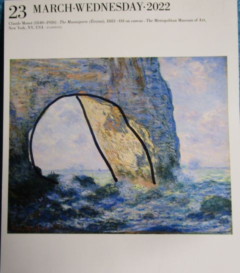
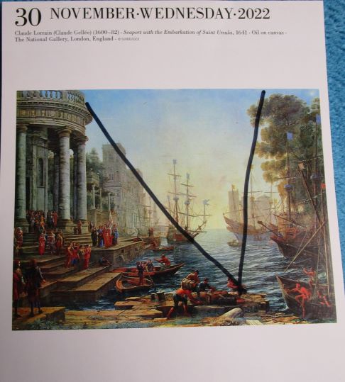
After a quick search of my calendar days, I did find a few more examples of composition forms.

 Bonaparte Before the Sphinx, Jean-Leon Gerome 
Asymmetrical (for Margaret!)


The Manneporte, Claude Monet
Tunnel


Seaport with the Embarkation of Saint Ursula, Claude Lorraine
V-Form

I really need to remember next year to mark up examples as they pop up on my calendar!  

On a personal note, I want to thank you all for showing up and linking.  Honestly, I don't know why I try to blog during our Rush season at work.  My customers have shown up in force this year and I've been talking to  50-60 ladies a day.  My mind feels like mush!  But there are worse ways to make a buck than to talk about pretty clothes all day!  

So What Have You Been Up to Creatively?

You are invited to the Inlinkz link party!

Click here to enter

Friday, December 2, 2022

Let's Talk Composition on Off the Wall Friday

 So it's that time of year again...time to buy my new Art Page-A-Day Gallery Calendar.  I've had one sitting on my desk for the last 10 years.  In fact, every day when I sit down to work, the first thing do is change the page so I can see what the "Art-of-the-Day" will be.  Throughout the day, I will glance back at the calendar noticing new things each time.  It's fun.  At the end of the year, I always go through picking out the days I want to save for inspiration.  

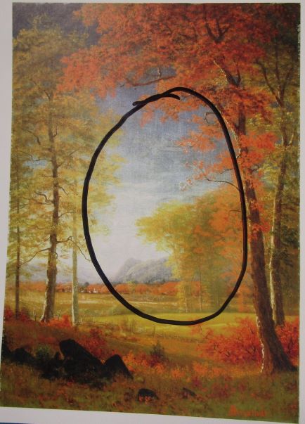
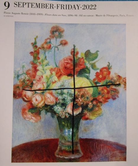
This year, however, I thought I would put some to use to talk about types of composition.  There are two things I look at when I first see a painting...#1 What type of composition does it use....#2 Where is the focal point.  Then usually I try to notice how the painter uses value and then hue to achieve both. 

Composition?!?  There are different types of composition?!?  As a matter of fact, there are!  Whether you're an art quilter or a traditional quilter, learning the types of composition will make your life easier when trying to come up with an original piece.

I pulled some days out of the year for some clear examples.

TRIANGLE - Psamanthe, Frederic Leighton, 1879 - (April 29th)


Circular - Autumn in America, Oneida County, New York, Albert Bierstadt (this isn't the best example but I liked this painting because I'm from Oneida County) (Sept 26)


Cross or Cruciform - Fleurs dans un Vase, Pierre Auguste Renoir, 1896 (Sept 9)


Balance Scales - A Winter's Day, Konstantin Ivan Gorbatov, 1934 (Jan 2/3)


Diagonal - The Voyage of Life: Old Age, Thomas Cole, 1842 (Aug 27/28)


See basic shapes lead to basic compositions which leads to great art.  All in a basic calendar for under 20 bucks.  I guess this falls under the category of ...it's the little things.

So What Have You Been Up to Creatively?

You are invited to the Inlinkz link party!

Click here to enter

Friday, November 4, 2022

All About Line (Part 2) on Off the Wall Friday

 So last week,  Michelle commented, "It’s funny, I’m aware of having different feelings about a piece, but I hadn’t really put together why."

  I thought WOW!  she gets it.  That is precisely why I do blog posts like this.  Improvisationally piecing is getting more and more popular.  It can grow organically, but it doesn't necessarily have to.  You can go into it with a loose plan in mind like a simple line drawing and a tone you want to set and then go from there.  I remember the day I finally realized that abstract design wasn't about just putting together random elements to get something pretty.  It's about expressing your vision in a way that is not figurative of things in real life.  

Anyways, last week I started this exploration of line with horizontal, vertical, diagonal, and arc.  


Curves are fun!  Smaller curves or waves are calming while big ones will be way more dynamic.  Curves can move the eye throughout a piece and give it motion.  I personally think Caryl Bryer Fallert-Gentry is queen of the curve.  Her quilts are all about movement, movement, movement!  You'll see curves repeated throughout my work too since they're so versatile!


Interaction #1, Caryl Bryer Fallert

Curves II, Nina-Marie Sayre

Line Weight plays a big part in the design too.  Thin short lines will evoke speed or delicacy while heavy fat lines will ground a piece and maintains order.  Valerie Goodwin's work is a perfect example of this.


Quilt Drawing #9, Daphne Taylor


Repetition of line is one that as quilters are very familiar with. Of course its all about rhythm.  We see it through traditional quilts as well as the modern quilt movement.  Season Evans has this down to a science!


Sophie Guinard


Row + Row Quilt, Season Evans


See?  There is more to line than just a mark between two points.  Remember, its all about what you're trying to convey!

So What Have You Been Up to Creatively?


You are invited to the Inlinkz link party!

Click here to enter