Showing posts with label value. Show all posts

Friday, November 15, 2024

Value is My Thing on Off the Wall Friday

Peppermint Reindeer by Laura Heini

 This week in my spare time, I started thinking about decorating for Christmas.  To tell you the truth, I'm not all that much into decorating, mostly because it takes so much time.  What I do like is designing the composition of the decoration scheme.  Yes, you read that right.  Your decorating has a composition just like your quilts.  One thing I've learned, is that all the elements of design I've been studying over the years can be used in a myriad of ways....like planning your Christmas decorations. 

But this post is not about Christmas decorating - you can thank me later - No, I say all this because it brought to mind my favorite way to evaluate a composition....studying the value of the piece.  If you're a long-time reader, you might have noticed that value truly is my thing.  Mainly because 

Color gets all the Credit, but Value does all the Work

Gosh, I must have been told that by the late great Joan Colvin about 20 years ago and it still holds true.  I pulled some truly random quilts from my Pinterest board to show you what I mean.  (I really did randomly choose them - mostly because they could be easily attributed).

Let's look at detailed look at embroidery textile by Mary Ruth Smith

Great right?  When you first look at it your just taken by the great use of shape and line.


Take the color out and you can see how it's all about the value in the composition.  The contrast between light and dark is giving this heavily graphic piece a lot of much needed depth.  Also, it emphasizes the use of line to form more movement and rhythm which would otherwise have come off very flat.  The darkest parts are acting like a solid ground for all that movement of line going on.  Without color to distract you, it's much easier to see what is truly going on.

This is An Evening Out by Colette Behrends 

Talk about a lot to unpack with this piece...WoW!  When you first look it's all about taking in how she so masterfully captured the moment.  It's all so relatable.  I love how it's figurative but still abstract.  The colors just add to the vibrancy of the piece eluding joy and energy.

Step back with this version of it...

Now you can better comprehend the composition.  See how easily you can see how she laid it out in a diagonal line.  Also, the focal points pop with the accents used to move your eye around the piece.  Again, the artist uses value to create depth as well as movement.   (hmmm I'm sensing a pattern).  Without getting too carried away, I also want to mention how well soft and hard lines are used in this piece.  That is a difficult thing to do and you don't see it that often done this well. 

Let's go totally abstract with a favorite of mine ...Emily Richardson's Original Copy (I want to confess a true bias where Emily's work is concerned.  I loved it from the moment I saw it, Then I took a 5 day class with her and it added this whole sentimental twist to my crush on her work)

Amazing right?  Now you can see why I have quilt crush.  The palette is so effective in this piece with it looking ethereal.  I love how the abstraction lets the viewer choose their own take on what it represents.  Honestly, in this form I just get lost in studying how the orange/yellow interacts with the blues. 

But in gray scale we get another look at it..


And for the third piece in a row  - what is value creating? Movement and Depth.  Honestly, this whole composition is about movement and depth.  With the color removed it's truly evident.  

So why do this exercise?  Just to play with pretty art quilts...well yeah...but mostly, it's to show that you can do it with your own work.   Traditional quilts or art quilts, it doesn't matter.  When you're laying out your compositions, take some time to take picture and desaturate it (way easier now that everyone had a camera in their back pocket for sure!)  Even take out the quilts that you think of your "dogs".  Take a value study picture of it and I bet you'll see why the quilt isn't quite working.  

Thanks for indulging me on yet another post on value.  

Oh, one last thing, so my new job has me writing a lot of emails a day. When I say a lot I mean 50-80 a day.  Twice this week - not once - but twice...people I email with mentioned the unique fashion of expressing myself through word and how they look forward to my emails.   Cracked me up - literally.  I thought, oh I know why.  It comes from chatting on blog posts for the last 15 years.  

So, thanks for that as well.  That's me this week...

What Have You've Been Up to Creatively?


You are invited to the Inlinkz link party!

Click here to enter

Friday, October 27, 2023

Easy-Peasy Value Studies - Off the Wall Friday

 So my last week of traveling got cancelled since I finally caught the dreaded Covid.  It took me 3.5 years so that is another thing I can mark off my bucket list!  Luckily, with the last variant, it amounted to little more than a cold.  It did disrupt my sleeping and eating though which seems to me so strange.So between those two things, I'm a bit of a mess.   It's also kept me out of the studio for two weeks which is a bummer.  Because of that...I am re-running a post I did on value.  The reason I chose value is that I think it's the most important element in designing your own work.  No matter if you're a quilter who does your own original work or one that chooses fabric for someone else's pattern, value is an important skill.  

So here is the post I wrote 8 years ago.


Okay, I admit it, I've been lazy and it's getting harder and harder to get into my studio.  I could blame a lot of things - domestic tasks. working full time, getting Tessa back into the routine of her senior year.   But honestly, I think it's me.

 Sometimes after a big project, it's hard to get back into the swing of things.  So I thought I would take it easy this time.

That said,  with the mood I'm in, I didn't want to over-exert myself looking for something new.  I know I want to play around with simple shapes and keep working on my abstract. . . but after that it is kinda of up in the air.  Luckily, I keep a pinterest board of inspiration.  Even when I'm lazy, I still manage to keep adding to my boards.

This time it led me to some modern architectural pictures which I found very cool.  Using them as the foundation of inspiration, I wanted to abstract them out without a lot of fuss.  Now I could go through tracing them and then doing value drawings by hand.  Why expend all that energy?

Instead, I used an online site - LunaPic - to help me manipulate the images.  I could use my photoshop but I always find it a little bulky.  This online source was easy and very intuitive to use.  For my purposes today I just grayed out the picture (took the saturation of color down to 0) and pixelated them. Instant abstract value study!!!   Easy-Peasy!!!


This was so fun I think I'll work on them a bit longer finding just the right one.  I have an idea of what I want to do with that but I'll save them for another post!!

So What Have Been Up to Creatively?


You are invited to the Inlinkz link party!

Click here to enter

Friday, December 10, 2021

More Value on Off the Wall Friday

 I would love to say that I've accomplished more this week, but  'Tis the Season and all that!!  All I can say is the house is nearly decorated so at least it's looking festive around here.

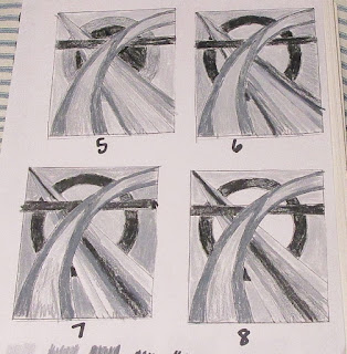
I did finally finish up my value studies with these last two.  I took the suggestion of my critique partner and tried some with the point of the ray going underneath of the circle.  Also, I wanted to try making the lightest parts of the curve on the outer edges which I definitely think adds depth.  I can see how the ideas have progressed as I tried different versions.  I think these last two are nearly where I need to be.


I also want to mention another handy trick.  Now, most people will take pictures of their work as they go.  Also, it's common to look at those pictures in greyscale to check out the values.  I went one step further and applied the introvert filter on PhotoShop Express. I've been trying out this photo editing app and find it easy to work with and has all that I need in an editor.  The introvert version of my trials, I found interesting.  Honestly, I think I'm going to have to really think about these last versions.  BUT it's definitely time to make a decision because they're all starting to run together!


I would start choosing the palette but I'm just too sleepy to do a good job.  At least it's Friday!  I'll have plenty of time this weekend to finally get my hands on some color and fabric!

So What Have You've Been Up to Creatively?


You are invited to the Inlinkz link party!

Click here to enter

Friday, December 3, 2021

Adding the Value on Off the Wall Friday

A Work Table of a Quilter?


About 10 years ago, Elizabeth Barton asked me to make value studies of the design I had chosen to do in her class.  No problem.....How many?

8

I beg your pardon?  Did you say 8? OMGosh!  Are you crazy? I sew.  I do not spend time coloring ... in greys!

But I did (Because why spend $600 on a class if you're not going to listen to the teacher, right?!)  Let me tell you it was time well spent.  Doing value studies really gives you good starting point once you start auditioning fabrics.  I mean think about it...You might pick the colors you want in your piece but how many fabrics do you have in those colors?  Do you just want to randomly start pulling them from your stash and auditioning them one after another?  Once you have your value study chosen then at least you know where the darks go - where the lights go etc etc.  It doesn't mean that you are strictly going to stick with your value map....but it's a start.

So my Sacred Threads Design continued this week (Yes this is week 2 and I still haven't touched fabric!).  I first want to give a big THANK YOU to Margaret Blank who pointed out that my original  chosen composition contained the sin of a tangent element.  With a quick google search I found out she was right so it was back to the drawing board! (And yes of course she was right..it's Margaret!)

So after scrapping the tangent praise lady... I decided to bring back another element I had originally played around with

Cross, Ray, Circles


Now this I was happy with.  So on with the  value studies.  I start with  the line drawing  and reduce it down to 25% .  The smaller sketches are easier to color in with colored pencils.  I made due with grays from my  prismacolor  set.  Later,  I did find that DickBlick sells an actual tin of gradations of gray scale pencils which I put immediately on my Christmas list!  

It took a long afternoon and several episodes of Star Trek Voyager but I came up 8 different variations of value.


In the beginning I was using big blocks of the same value while later I started playing with an ombre effect which of course added even more movement.  (Sorry it isn't exactly clear in the photos) .  I do like how by placing the lightest of the lights in the circle it creates a window effect,  Also it adds emphasis to what probably will be the focal point - where they all intercept.  

One thing I did noticed was that they all seemed a bit "stodgy".  I've been watching a lot of the British Bake-Off lately and the Britianism's are starting to wear off.  (Stodgy - heavy, filling, full of carbohydrates).  So a composition that I wanted to contain light and movement was being weighted down.  hmmmm but by what??

So I went back to the original inspiration by Georgia OKeefe.  Here it is in greyscale.  See what she did?  She broke up the values to give more movement, helping the curve recede and then draw forward.  Cool right?  So I'm thinking I need more of that!  


And yes that means I need to do some few more value studies before I can play with fabric.  Elizabeth would be so pleased..grin


So What Have Been Up to Creatively?

You are invited to the Inlinkz link party!

Click here to enter

Friday, March 12, 2021

Masterclass Session III on Off the Wall Friday


 My masterclass with Rosalie Dace continued last week with us delving into the world of pattern and rhythm.  Listening to these lectures which are recorded so you can re-listen to them I find very helpful.  It's not that it's new material.  It's that #1 material that you just don't think of in your everyday of housework, errands and laundry and #2 Rosalie offers these "nuggets" of wisdom that help you focus on what is important.  This lecture really focused on pattern and rhythm in your everyday life.  I especially found this fascinating.  I do promise to explain what I mean in a later post but for now.....

I NEED TO FINISH MY EXERCISES ON COLOR AND VALUE from week #1.  Why is it that quick little projects seem to take on a life of their own?  But I promised myself I wouldn't rush through these and I'm not.  I'm all happy with this composition and where it's going. Reading Left to Right...  Column #1 is Black/White ... Column #2 Black/White and shades of neutrals ... Column #3 Black/White and the primary Red ... Column #4 Black/White/Primary Red and the Analogous color Orange . (Analogous color is the color that is your neighbor on the color wheel)


Some Observations (because that's why I'm doing this exercise)

  • Black/White it's all about a strong graphic statement.  It's all about contrast.  There is no wiggle room...no mystery.  It's strong but flat
  • Adding the shades and tons of black starts to give it a little depth but I didn't add enough for it actually to matter a whole lot.
  • With the Red, a whole new person is invited to the party.  Now it's not just a conversation of two people but three with all that that entails.  You can tell  too.  It's going from this vary graphic statement to a composition with more nuance.  This is starting to draw you in more to see the little bits.  How the shades of Red interact with the shades of the neutrals is very interesting.
  • So when Orange joins - well now the party is in full swing.  Tessa took one look at it and said wow that got busy.  It did but it's not just the piecing.  It APPEARS more busy because now you have two neutrals and two hues and all their values playing around.  It's no longer this graphic statement but several little compositions interacting with each other.  Also now the neutrals are not just highlighting the red but it's also about the relationship between the orange and red.  
Since each of these are taking 2-4 hrs each they're going slow.  I do love piecing .  It's so relaxing!!  The

next  column is Black/White/Red and its compliment Green.  I'm also thinking about doing one that is black/White/Red and two analogous colors ... but hmmmm I dunno.  See what I mean ...A LIFE OF IT'S OWN!

 Things I Like...

Did I tell you I got a pair of Kai 7170 Professional scissors for Christmas.  Omgosh!!  I'm in love with them.  Not only are they the sharpest scissors, I've ever owned but the action on them is so amazing.  Every time I go to cut fabric, I'm reminded how wonderful they are.  Their handle is just right too.  Not to hard - not to soft.  I told my husband now I want another pair so I can stop reaching all over my studio for those specific scissors.  All my other scissors just sit on my table unused.  WORTH EVERY PENNY!  I just wish they had a pair that was a 5" range or so.  I use both sizes a lot in my studio.


So tomorrow I took a half day off to sew and maybe - just maybe - I'll finish up my value/color exercises so I can work on rhythm and pattern - grin!!  It's good to be back in my studio!

And just because I don't say it nearly enough.  Your thoughtful, comments mean a lot to me.  I'm always a bit shocked people actually read my posts more less comment!!  So THANK YOU!

So What Have Been Up to Creatively?

You are invited to the Inlinkz link party!

Click here to enter

Friday, September 18, 2020

The Value in the Umbrellas - Off the Wall Friday

 I'm so happy to be sewing regularly again.  I try to get in a couple of hours a day which goes a long way at getting a quilt done...go figure!  Progress Report on the Umbrella Quilt....40 Umbrella Blocks done ... 40 Fussy Cut Little Girl Blocks Done ... 10 Pin Wheel Blocks Done. (For the record I literally had to take out my first quilt book I ever used to remember how to do quilt block math and get my half square triangles to come out right .... how soon we forget!! )


I stopped right there and looked at all these little 6 in blocks I had amassed.  A lot of blocks considering I had  no set in mind.  I do know what I didn't like in the original pattern set.  It was #1 the lack of Underlying Value  & #2 Not Enough Whimsy for the Cute Fabric.  Now this isn't a criticism of the original designer.  The pattern was suppose to be for a beginner quilter who wanted to get her feet wet in EPP and applique.  But my obsession with the Abbie fabric line has moved well beyond THAT.


The original Quilt Pattern

I have been  brainstorming some ideas.  I found plenty of more of the Abbie fabric line to play with so that was no problem, but one thing I've noticed.....a lot of the prints read the same value.  With so many middle medium values, it's hard to put together a quilt design.  Luckily there are some really nice lights around those little girls, but nearly enough darks for my taste.  So I started there.

Since a good idea is to ALWAYS MAKE VISUAL DECISIONS VISUALLY....up the blocks went for a quick mock up.

The pinwheels are working ...with more of them they are adding some much needed movement and whimsy to it .... but they are still sorta all medium-medium.


See how just a little black makes everything around it pop?!  Now the question is how much black and where.  One thing I did not like about this collection is only one dark-dark - a black - sighhhhhhhh.  EVERY COLLECTION needs some really good light - lights and some good darks-darks!

There is this idea hmmmmmm but I don't know ....I'm thinking these blocks are too big - they would have be way littler if I do it!!


Anyways that's where I'm at......

Since I'm finally heading to go see my parents this weekend ... yes across state lines...Call Gov Cuomo and Gov Wolfe....I'm making a jail break.... the umbrellas will have to wait a bit.  I have some good ideas though to add a bit more whimsy to it and some scrappy bits.  Every little girl's quilt needs some scrappy bits.  

Honestly with my own princess turning 23, this might just have to get done waiting for her first daughter.  OMG did I just say that?!?!?!  These Abbie prints ARE getting to me.

So What Have Been Up to Creatively?!

You are invited to the Inlinkz link party!

Click here to enter

Friday, May 3, 2019

It's all About Value...Off the Wall Friday

I'm not ashamed that I'm stumped.  I've been diligently working on the pinwheels and it's getting to place where I really do need some kind of loose value sketch on where I want to put the dang things!  I kinda sketched out some ideas but honestly, I didn't like one more than the other.  They all kind of were just ....well....blah.

So I reached to my favorite teacher, Jeannette Meyer to ask if she had any good hints (she always knows what to say to get me moving in the right direction) and she suggested I take two things into consideration...

How do I want the viewer’s eyes to move? 
and 
Where do I want the areas of highest contrast?


Good advice (as always)....but with this piece really I had no set visual path in mind, no focal point to highlight.....well....at least not yet! 


What I thought this needed was some inspiration.  So I thought I would take a look at how other artists handled value in their pieces.  One that instantly came to mind was  Edvard Munch, The Scream One of the great things about this painting is how he uses value to direct the eye right to where he wants you to look.  The grayscale version of it really shows how masterful the placement of value is!


I could even look for inspiration in paintings that are more abstract like Gerhard Richter's #9 Abstrakte Bilder Series.  I love this painting mostly because of the mystery it holds. Still, I never thought about how the wonderful colors really disguised how well the underlying value was working.  Its really is an interesting placement of lights, medium, and darks.


But no matter how great these were they still didn't seem right for my piece.  Then I started to look at my old blog posts because not only is it a great place for quilt, fiber artists to meet every Friday but its also acts as my creative journal.  I mean, come on, this isn't the first time I've wrestled with value!  So I popped back to my post here and it gave me the idea to look at my pinterest boards!  Not to mention it reminded me how much I liked LunaPic and how easy it was to use.

And finally.....FINALLY.... a value layout I like!!

So I used this......
To get this.....

I'm thinking this one is a KEEPER!!  Now I just gotta get the pinwheels done!!  This weekend I got about 30 of them done listening to The Woman Who Smashed Codes by Jason Fagone which I'm enjoying quite a bit.  It starts out a bit slow and then you can't stop listening!!

Well, that's one more thing I can check off my THINGS TO DO list!!

What Have You Been Up to Creatively?


You are invited to the Inlinkz link party!
Click here to enter

Friday, July 22, 2016

Big Idea at QBL - Off the Wall Friday

OUR CLASSROOM - GREAT HUH?!
Greetings from Quilting by the Lake 2016 Wow!  What a great week I'm having in Rosalie Dace's class, Skin Deep.    We're studying layering and transparency using sheers and other non-traditional quilting fabric - aka NOT cotton!  Its was so fun getting out my vast collection of sheers for this
class. Its finally a chance to play with all the shiny princess fabrics I've been hording!

Rosalie, as always, is great!  She has been suggesting a series of exercises each day for us aimed at getting us comfortable with manipulating the sheers to reveal and conceal our work.  Now, since she's the type of teacher that understands that each student is unique, she also gave us the choice to do those or  work on a couple of smaller pieces the whole week or work on one big piece.

And what did I choose??  Yep!  You guessed it - one big piece.  Now, this week I wasn't going to - truly!   But when one gets a big idea - one has to go with it!  So I did!!

As always, I started with a value sketch and then picked a palette.  Luckily I only brought one palette
with me so that made that part VERY easy.   I recreated the sketch by just working out the proportions of the jars when blown up.  Then just matched the jar with the right fabric - easy right?  Not!!  I spent a bunch of time in trials.  Here's  a peek into the process ...


FOCAL POINT TOO LIGHT

FOCAL POINT IS MEDIUM VALUE TOO DARK (SMALL RED VASE)
It is nice to have a splash of red in the corner

FOCAL POINT NOW BLENDS TOO WELL WITH THE BACKGROUND
This one is just right - BUT it blends so well that it changes the focal point to the patterned hand dyed vase on the upper right.

The rest of the designing went pretty easily.  In fact, so easily that I'm the process of adding thread work and quilting.  Next week I'll share with you a complete review of my week of QBL as well as the finished piece!

So What Have You Been up to lately???

Friday, September 25, 2015

Easy-Peasy Value Studies - Off the Wall Friday

Okay, I admit it, I've been lazy and its getting harder and harder to get into my studio.  I could blame a lot of things - domestic tasks. working full time, getting Tessa back into the routine of her senior year.   But honestly, I think its me.

 Sometimes after a big project its hard to get back into the swing of things.  So I thought I would take it easy this time.

That said,  with the mood I'm in, I didn't want to over exert myself looking for something new.  I know I want to play around with simple shapes and keep working on my abstract. . . but after that its kinda of up in the air.  Luckily, I keep a pinterest board of inspiration.  Even when I'm lazy, I still manage to keep adding to my boards.

This time it lead me to some modern architectural pictures which I found very cool.  Using them as foundation of inspiration, I wanted to abstract them out without a lot of fuss.  Now I could go through tracing them and then doing value drawings by hand.  By why expend all that energy?

Instead I used an online site - LunaPic - to help me manipulate the images.  I could use my photoshop but I always find it a little bulky.  This online source was easy and very intuitive to use.  For my purposes today I just grayed out the picture (took the saturation of color down to 0) and pixelated them. Instant abstract value study!!!   Easy-Peasy!!!

This was so fun I think I'll work on them a bit longer finding just the right one.  I have an idea of what I want to do with that but I'll save them for another post!!

So What Have Been Up to Creatively?


Friday, February 14, 2014

The Sketches - Off the Wall Friday

As promised here are my three sketches.

The first is a return to my praise ladies series.  Once again the main problem with this one is that it implies movement rather than covey it.  Also Elizabeth felt that the "Halos" looked too iconic - which upon reflection - I think she's right.  I think varying the poses of the three ladies would help - that said - I think this is the beginning of a good idea.  But maybe not for this week. Or this month.


The second was a little stronger.  I can't tell you how many of these I drew during the week - this being the one I liked the best.  Elizabeth was bothered by the ray going into the other ray - but I did that on purpose creating a focal point.  I think with the right palette this would be very cool.  hmmm maybe . . . . or maybe not. . . .


The third was the strongest. The use of texture and value could totally make this piece great.  On the other hand - how to create all that texture and value????  Not often - if ever - am I stumped on how to create a design. sigggghhhh - then this one came along.   I first thought I would pick a palette and rough edge applique pieces into the composition.  But I thought it would come off too graphic - too 2-D - even with the quilt line added at the end.

THEN I got the idea to do it whole cloth and add the texture with quilting.  At first I thought I would do it by hand - but since I have a life  need to get this done by the end of the month  I think I'll do it by machine - which ought to be interesting. 

I've never attempted to put that much stitching into a project - adding values as well as texture  with just thread should be a new adventure.  I guess that's what a master class is suppose to be  - exploring new topics - practicing old ones and stretching beyond your normal way of creating.

I'm quite sure I said to Elizabeth - something along the lines - just throw them into the deep end and see if they can swim!

Ohhh and Hug! Hug!! - Kissy! Kissy!  Happy Valentines Day!


So what have you been up creatively?