 |
| A Work Table of a Quilter? |
About 10 years ago, Elizabeth Barton asked me to make value studies of the design I had chosen to do in her class. No problem.....How many?
8
I beg your pardon? Did you say 8? OMGosh! Are you crazy? I sew. I do not spend time coloring ... in greys!
So my Sacred Threads Design continued this week (Yes this is week 2 and I still haven't touched fabric!). I first want to give a big THANK YOU to Margaret Blank who pointed out that my original chosen composition contained the sin of a tangent element. With a quick google search I found out she was right so it was back to the drawing board! (And yes of course she was right..it's Margaret!)
So after scrapping the tangent praise lady... I decided to bring back another element I had originally played around with
Cross, Ray, Circles
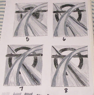
Now this I was happy with. So on with the value studies. I start with the line drawing and reduce it down to 25% . The smaller sketches are easier to color in with colored pencils. I made due with grays from my prismacolor set. Later, I did find that DickBlick sells an actual tin of gradations of gray scale pencils which I put immediately on my Christmas list!
It took a long afternoon and several episodes of Star Trek Voyager but I came up 8 different variations of value.
In the beginning I was using big blocks of the same value while later I started playing with an ombre effect which of course added even more movement. (Sorry it isn't exactly clear in the photos) . I do like how by placing the lightest of the lights in the circle it creates a window effect, Also it adds emphasis to what probably will be the focal point - where they all intercept.
One thing I did noticed was that they all seemed a bit "stodgy". I've been watching a lot of the British Bake-Off lately and the Britianism's are starting to wear off. (Stodgy - heavy, filling, full of carbohydrates). So a composition that I wanted to contain light and movement was being weighted down. hmmmm but by what??
So I went back to the original inspiration by Georgia OKeefe. Here it is in greyscale. See what she did? She broke up the values to give more movement, helping the curve recede and then draw forward. Cool right? So I'm thinking I need more of that!
And yes that means I need to do some few more value studies before I can play with fabric. Elizabeth would be so pleased..grin
So What Have Been Up to Creatively?


4 comments:
Wow, you think a lot more about your design than I do. I'm seeing how it pays off. Yes, now I see the tangent element. That Margaret, she's always right!
Oh my, you put so much thought into planning a project. I am impressed!
Oh, I'm so glad your post dropped in my inbox today - I learned so much! This is going to be such a cool quilt. I like the grayscale process, and those pencils would be so helpful! Thanks for posting! (And you reminded me I need to look up the difference between stodgy and claggy . . .)
Now you've made me laugh -- and blush! Sheesh! But I do like your new approach -- and bless Elizabeth Barton for her value studies, eh? (Yes, I took her class too...)
Post a Comment