
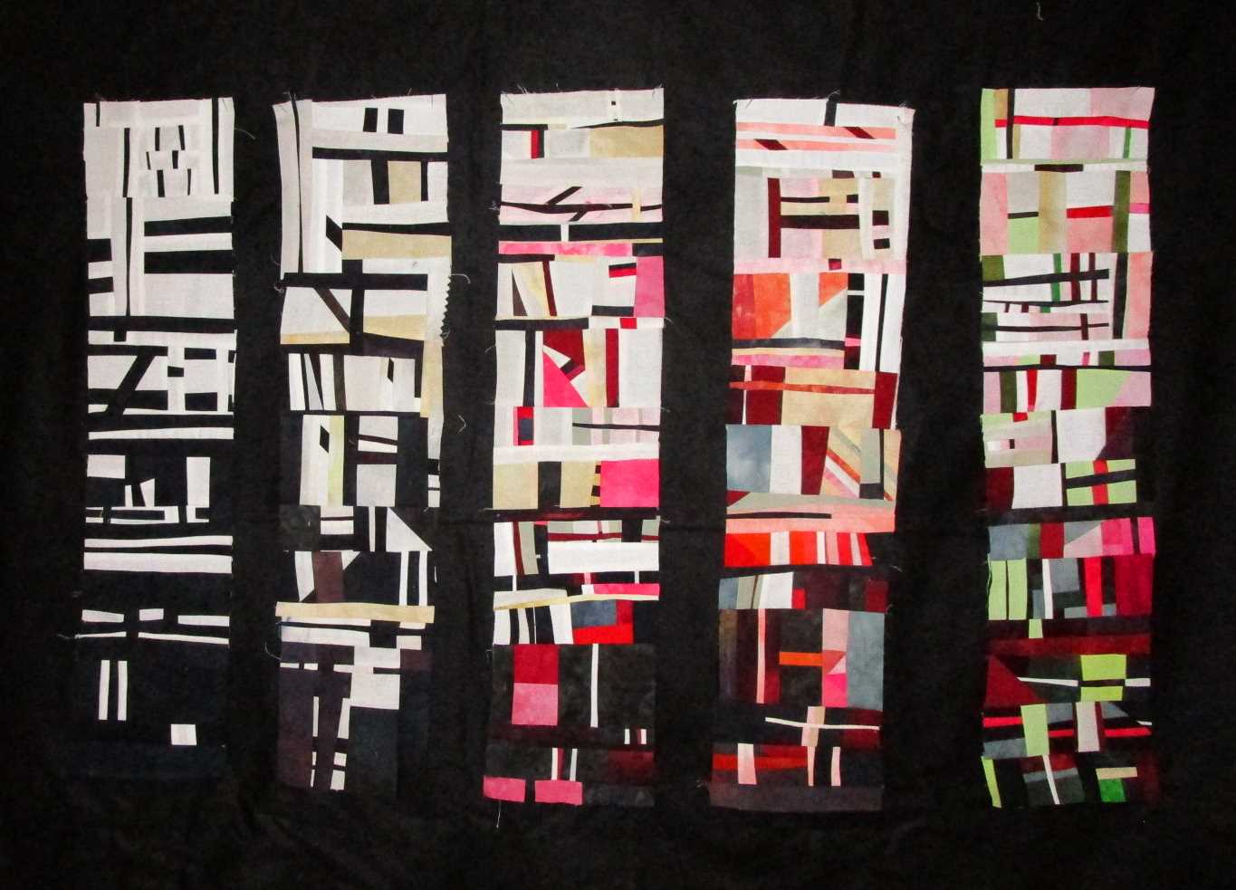
So last week, I finally finished up my first exercise in color and value. I'm all proud of myself since it really illustrated visually what I knew intellectually. So much easier with a picture don't you think?
You can see my observations on the first four columns here. This week I added the last which was to add the complementary color of the red - green. Now it didn't turn all Christmas which was my daughter's guess. I knew enough to combat that by changing the saturations of the green. What I did notice was that as always complimentary colors play off each other giving a lot of give and take between them The conversation at this party gets loud with the white and black and grey kinda just fading in the background. I mean really ... in that last column do you even notice all the white, black and grey in there?

With those done, I wanted to see how the column interacted with each other as well as different backgrounds. So through this whole process I've kept them in columns on my white design board. I'm actually rather shocked at how well they look together now that they are done. The white to me seems to just sort blend away. It doesn't seem to pick up the white in the piece any better or worse. It definitely doesn't make for a good "frame" for all that chaos....in fact to me it just makes it feel more chaotic since the white along the edges "leak out" on all sides.

So let's change it up with a black background.
The black gives it the strength and grounding it was craving. Also it makes the white parts pop. I find the sashing gives a bit of stability to the chaos of the columns.

Now this was interesting! All the black bits are giving a subtle "structure" to the piece. It's like the glue that holds it all together but not nearly as uniform as the sashing in it's sister piece. Also, notice that there are just as many black pieces leading out to the edges as the white above. But these don't have the same "leaking" effect. Instead it gives them a STOP softening the edge but still giving it a distinct edge.
THEN I stole Tessa's grey blanket away from her. Actually I originally bought it for this exact purpose but it was so super softie in microfiber that she stole it from ME. Just as well though since all that polyester captures the light and reflects it back to the camera which kind of defeats the whole purpose of using grey.

That all said, you can see that grey really is a true neutral in both cases. It doesn't do much for the piece but it doesn't really detract from the columns. It's not strong enough to add the stability the piece needs but it's not letting the white leak all out the sides and bottom. Sometimes grey is perfect, but I'm thinkin' this time it's not.

At the beginning of these trials, I had no idea what I wanted to do with these columns. I mean really you could sit in your chair and talk your way into a plan that might or might not work. But just by doing a few visual trials really gives you a better picture of how the columns will react with each other and a potential background. This information can then be ferreted away for the next time so you might not need to go through all this!
I'm going to finish this piece off with one of the black options but just haven't figured out which. I'm not a big fan of "frames" on my pieces but with this mess - yes - it needs a frame. I'm so happy I took the time to work out these exercises!
So What Have You've Been Up to Creatively?
9 comments:
Bonjour,
Pour moi, j'aime bien le blanc , car il adoucit le chaos de la pièce et permet l'imagination de travailler, mais cela n'est que mon opinion
meilleures salutations de Suisse
Hello,
For me, I like white, because it softens the chaos of the room and allows the imagination to work, but it is only my opinion
Best regards from Switzerland
Fascinating series of exercises and experimentation. You are tempting me to try this myself.
Wow! That is so interesting. I really love the black background. I'm also tempted to do this. Love it! Thanks for the inspiration.
Have you tried it with a vertical black line between just some of the columns?
I really like the columns all next to each other with the black frame. When they are separated I don't know what I should be looking at. This is an exciting art piece.
Hi Nina-Marie - I really enjoyed this exercise and learned from it. Now, I am wondering what it could be if you made the columns into rows, or if you jumbled their order. Would it still work as an art piece?
I also loved the columns next to each other with a black background. It really makes the colors pop.
Wow this is a great exercise and you should be proud that you did this. The pieces are truly wonderful and make such and exciting art piece.
Very interesting exercise! I also like the black frame best of all your options. I wonder what it would like if you made one or more sides of the border wider than the others sides. Making it an asymmetrical design, and adding some negative space?
Post a Comment