 |
| New York Movie, Edward Hopper, 1939 |
 |
| Before the Mirror, Berthe Morisot , 1890 |
Still, its a bit of shock to go through my two favorite painting art books (World Art, the Essential Illustrated History and 1001 Paintings You Must See Before You Die) and find page after page of naked ladies. They are doing a variety of things but into the 19th century, you can see how how the male artist are fascinated with a women's toilette. So many paintings of ladies bathing, brushing their hair, dressing, undressing etc. . . . you get the picture.. . . and if not . . . I'm sure you can find a painting of it easily. I guess I never realized how big a part naked ladies played in the history of art!
 |
| Königstein with Red Church, 1916 Ernst Ludwig Kirchner |
Wrong!! You need to pick out a painting that visually attracts and intrigues you. Also, it has to have enough color, patterns and textures so that it can springboard for your future abstraction. We'll be putting the painting through it paces since we'll be doing a series of exercises and abstractions to come up with a new inspired composition.
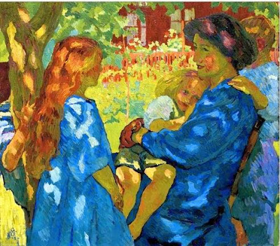
After much back and forth I've narrowed it down to these four. I was thinking I could get your opinion and thoughts on which you like the best and why. As for my opinion. . . I love them all. The finalists here all have colors and shapes I love. I tried to pick a painting that I won't get sick of even though we'll be doing an extensive study of them. They all have palettes I love and I don't know a lot about any of the artists so it will be fun to do the required homework on their backgrounds.
 |
| GIOVANNI GIACOMETTI (1868-1933) Sotto il sambuco (Unter dem Holunder), 1911 |
So which would you choose and why?
ohhh and
What have you been up to creatively?

23 comments:
Wow, those are some good choices! I am drawn to the GIOVANNI GIACOMETTI-I love that dappled sunlight. But for what you're doing the Edward Hopper gets my vote. It has a lot of emotion, room for interpretation and lots of great value changes. It will be fun to see what you do with it.
For me, Königstein with Red Church, 1916 Ernst Ludwig Kirchner would be first choice since I like angles. GIOVANNI GIACOMETTI- is nice too with it's curves. I am sure yours will look fabulous whichever you choose.
I would choose Konigstein with Red Church because it looks to have a lot happening in it and therefore give you lots to work with. Have fun!
I'd pick the Giacometti, because of the colors and the textures.
I'd choose the Giocometti because It speaks to me-as a mother. Its soft quality is amazing...hugs,Julierose
Hummm.....all are wonderful options but personally I'd select the Giacometti's, purely for its color!
My preference goes to Giovanni as well. It has great colors, different shapes - both curved as well as squared in other words lots of possibilities.
I like the last one for lights and darks. I did a study on Hopper and loved the outcome. LeeAnna
Definitely the Kirchner townscape. So many different shapes and lines for inspiration. Primaries plus a lot of green. And who are those people and why is that woman leaving the scene? What's not to love?
Diane
I'd go with Kirchner as first pick, closely followed by Giacometti. In both cases it's mostly about colour, but I also love the shapes and angles in the Kirchner.
I like the last one the best. It evokes emotion for one and that red hair on the girl is lovely.
Giovani.
Love the palette, subject matter and the patches of unblended color.
I'd pick the Edward Hopper. I love the lines and angles to work with. If you would prefer curves, one of the other paintings would be better. I look forward to seeing the results of your class. Have fun!
Would love to see what you could do with Red Church! Can't wait to see what you choose.
I see why those four made your cut; they're all wonderful. But the Kirchner jumped out at me. What fun that one would be to use as inspiration for abstraction!
The Giacometti! So vibrant!
the Red Church!!!
I love the last one for the brilliant colors and sharp contrast.
Sounds like a great course. I want to get to QBL someday.. not too far. My choice would be.. Königstein with Red Church- love the composition and colors I guess
Can't go wrong with that Hopper!
Nina Marie, I personally like 'Before the Mirror'. At least it would be my first choice. I think it would be challenging from a lighting perspective as well as line/texture perspective. Beyond that, it would be interesting to see if it could be translated into a fabric piece. My 2 cents. Have fun with whichever one you choose to use for your upcoming class!
I think the second two could be quite literally be recreated in fabric so it would be better to choose the first two to push you in more unexpected directions
You know me, I'd go for the nudie!
Post a Comment